Project
Goals
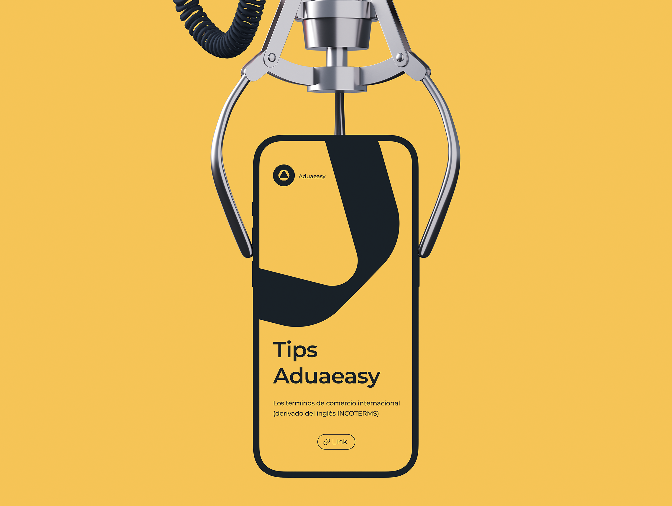
The aim of the redesign was to strengthen Aduaeasy's international presence, reflecting its new values of technology, management and growth. A logo was created that integrates the letter "A" with an ascending arrow, symbolizing the progress they offer their clients.
The website had to be intuitive and easy to navigate, allowing clear documentation of customs processes and legal requirements. The challenge was to organize the information efficiently, guaranteeing an agile and accessible user experience.
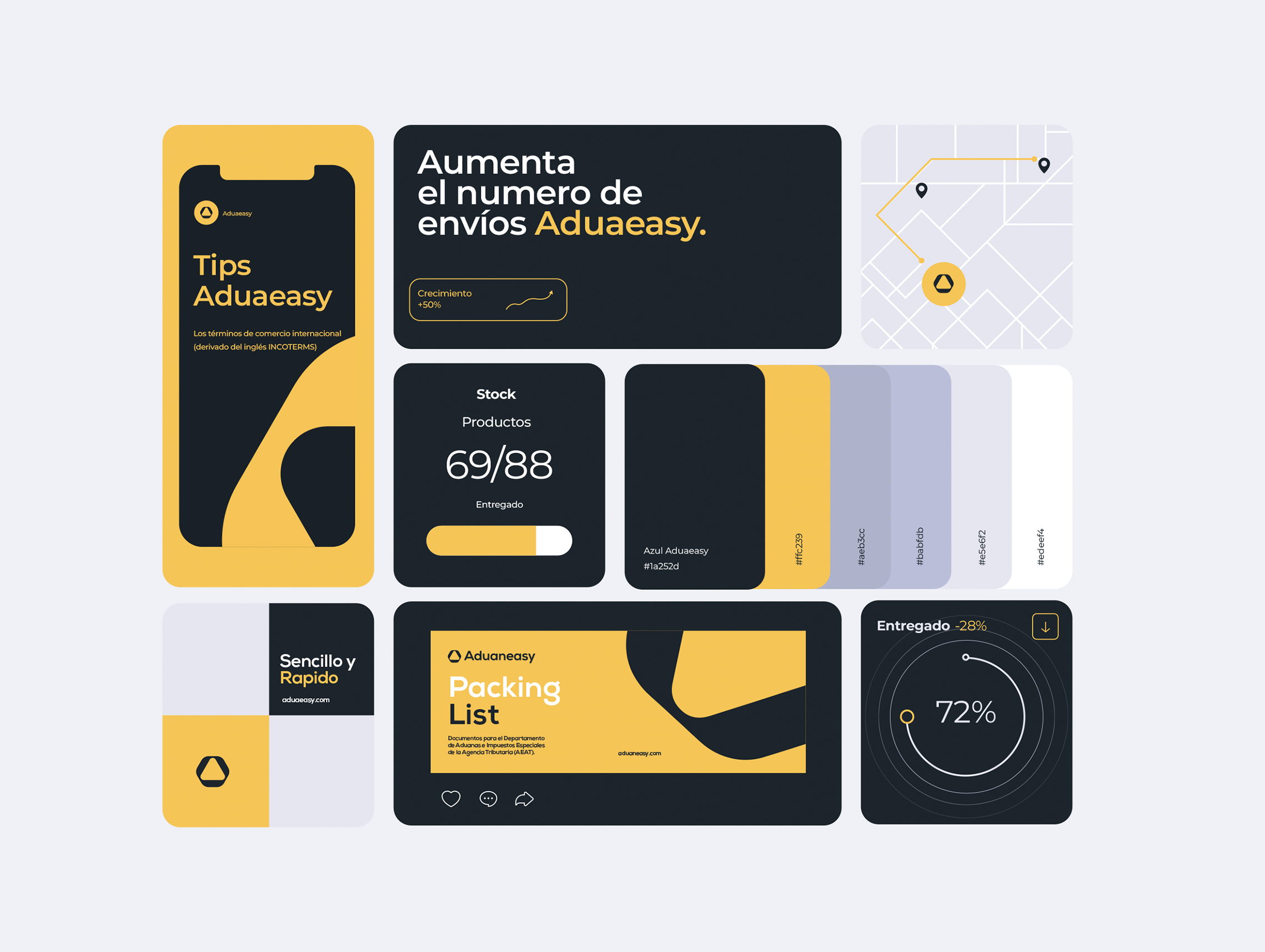
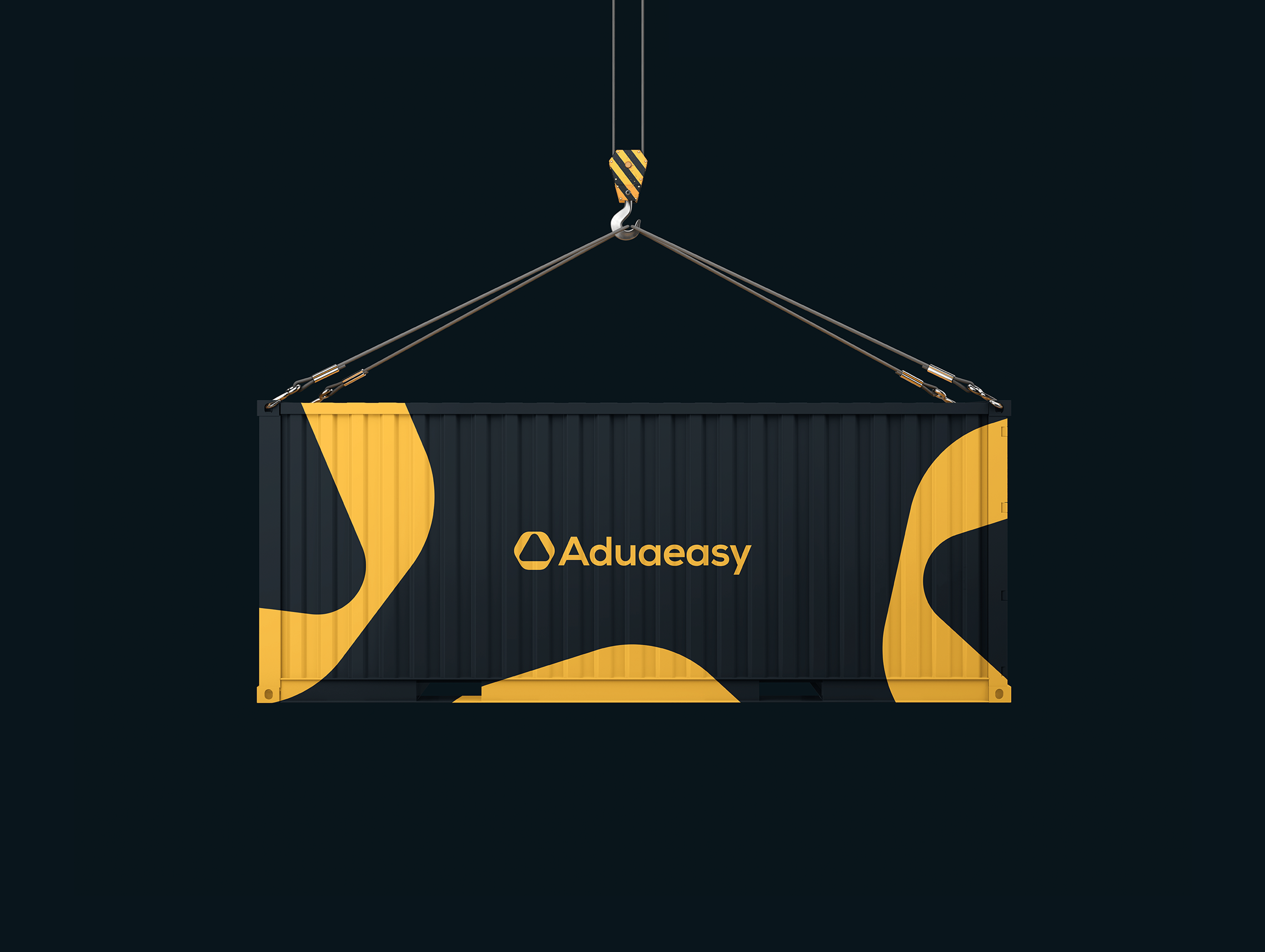
The new image of Aduaeasy seeks to promote the company's vision of technology and growth, with a website that offers clear and efficient navigation.
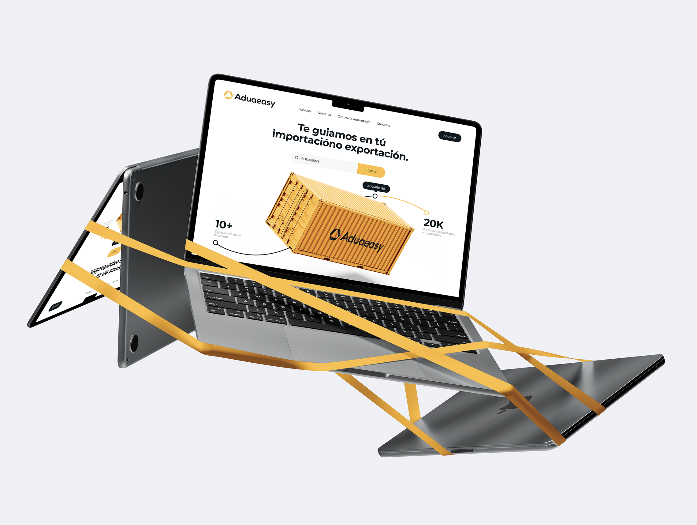
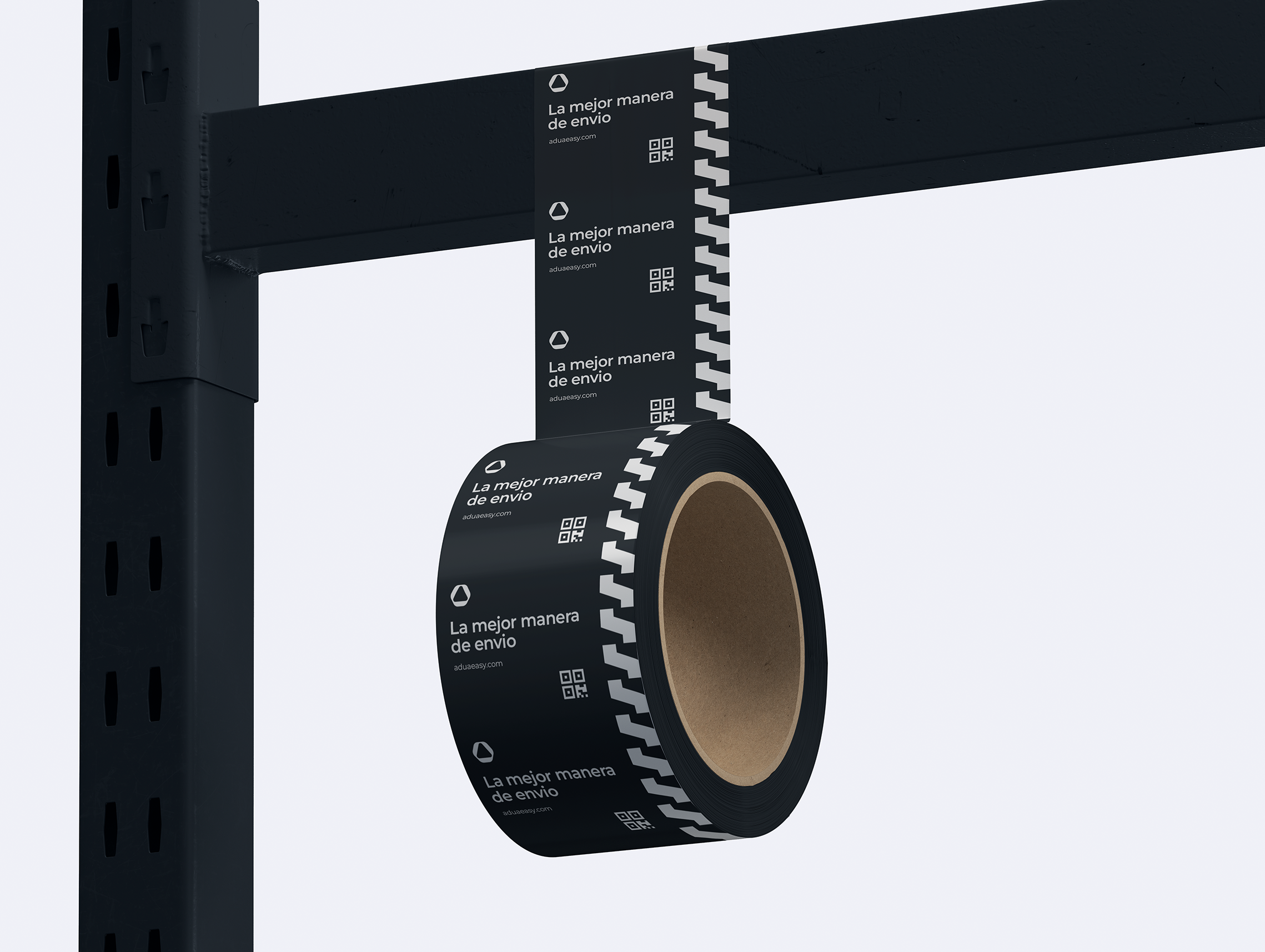
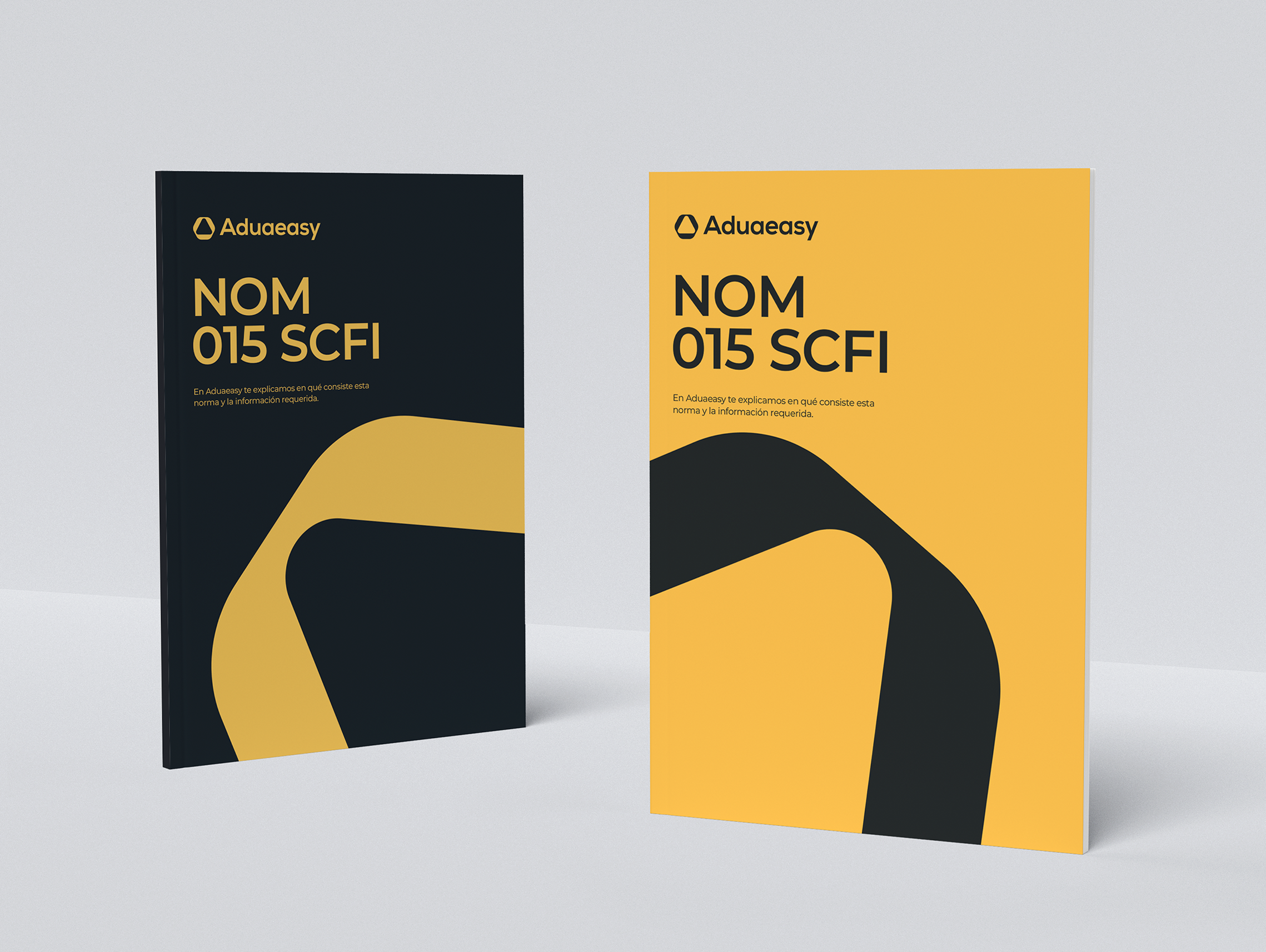
A brand that reflects modernity and technology, with a minimalist design and a website optimized to improve navigation and user experience.
Brand Strategy
Communication
Customer Engagement
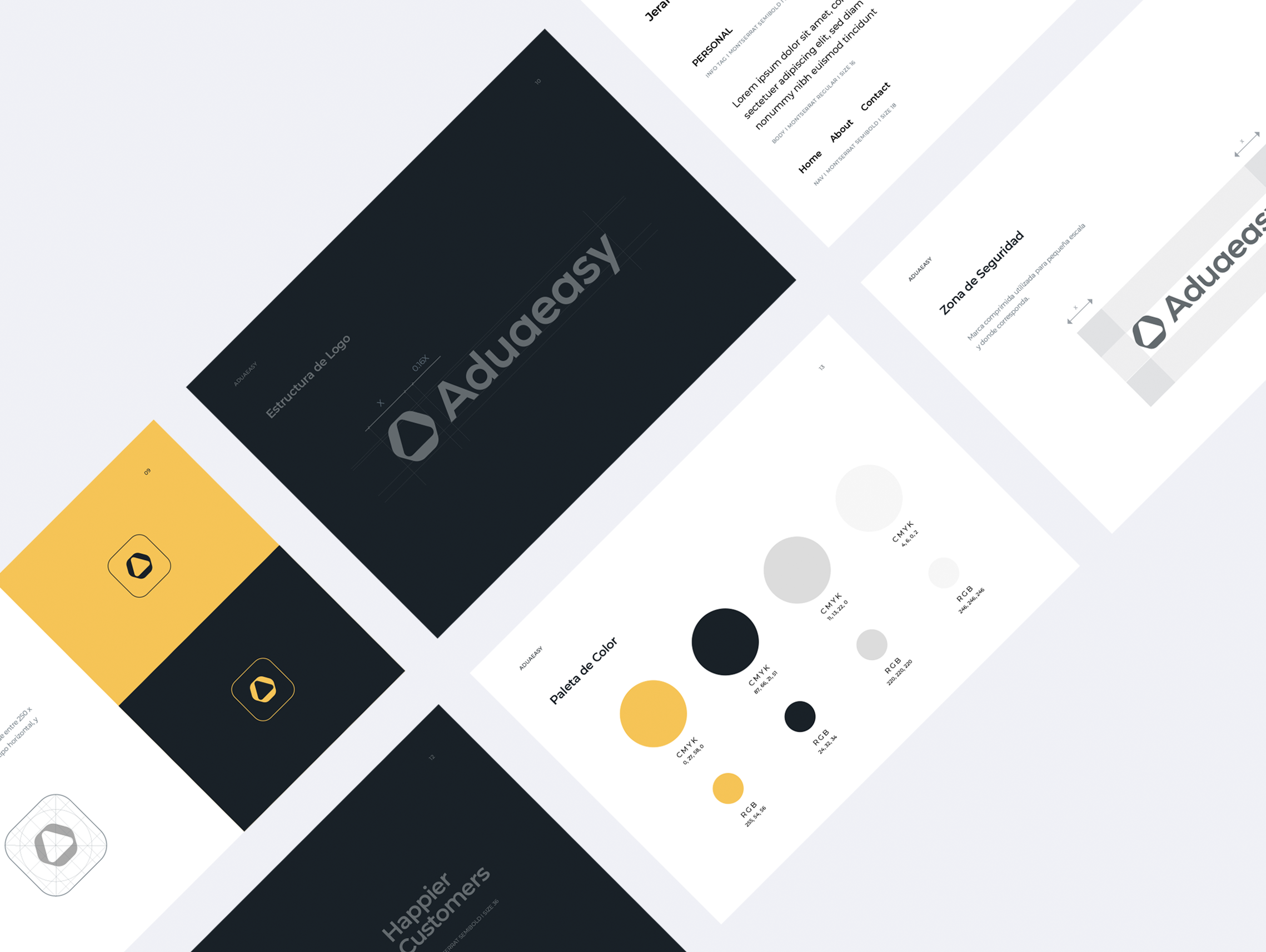
The process began with an analysis of opportunities in the industry, highlighting the need for a modern brand that reflected technology. To achieve this, a clear and contemporary visual identity was defined, using a minimalist design and contrasting colours that conveyed professionalism and ease of understanding. An identity manual was created to standardise visual communication and ensure its coherent expansion.
The website was redesigned with a simpler navigation structure, improving access to information and user experience. The result was a strong brand, aligned with innovation, and a more efficient and accessible website.


