
Project
Goals
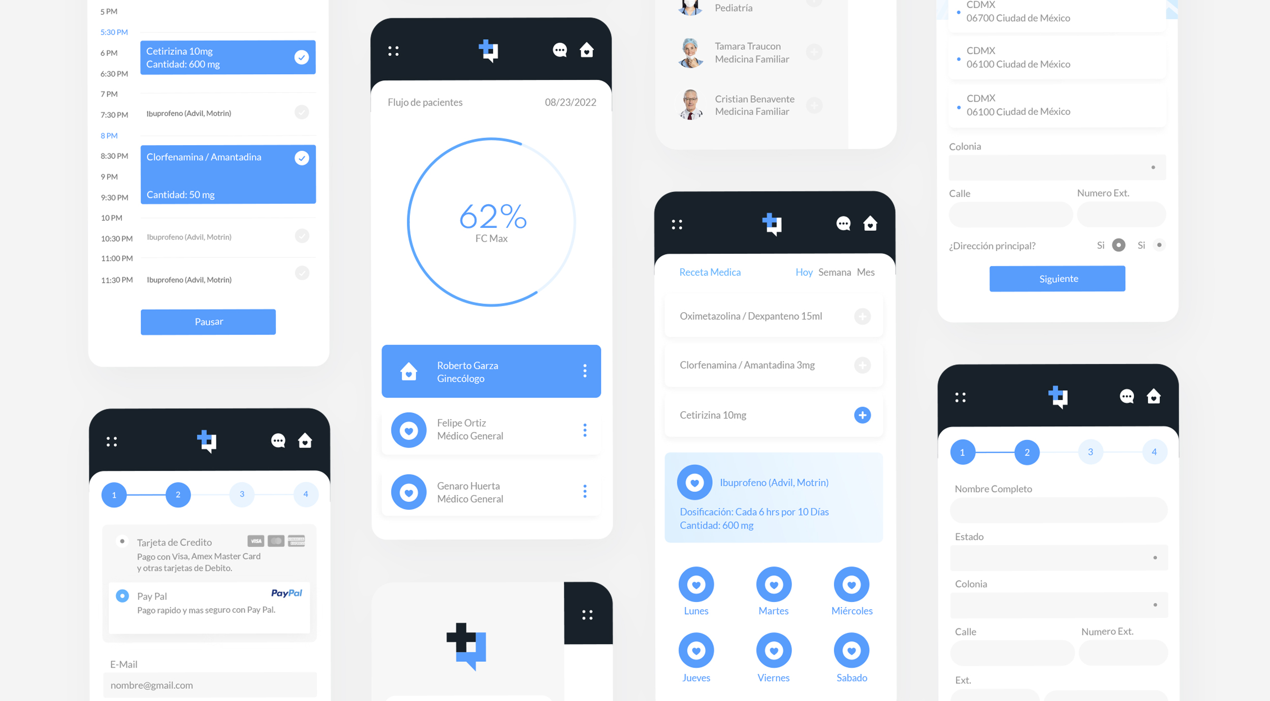
The main goal of the project was to create a simple and quick-to-use interface for both patients and doctors. To achieve this, navigation paths were simplified and a clean, minimalist interface was designed, intended to facilitate interaction. An important challenge was to convey a serene aesthetic that evoked order and calm, similar to that of a hospital environment.
In addition, the need for doctors to be able to manage multiple patients efficiently was prioritized, so both the application and the wireframes were designed to make their workday easier and more agile.


A streamlined and efficient interface designed to facilitate patient management and optimize workflow, offering clarity and agility for both doctors and patients.


A simple and accessible experience, with a minimalist design, simplified navigation and a focus on improving usability and functionality for users.
Brand Strategy
Communication
Customer Engagement
The design process focused on creating a simple and accessible experience. A minimalist identity system was developed, featuring a logo that merges a chat and a medical cross. The interface employs light colors and a modular system, simplifying navigation.
To optimize usability, the sitemap was reduced to the minimum necessary, avoiding complex structures and minimizing the number of wireframes. This approach enabled the creation of a more friendly, easy-to-use application aimed at improving the end-user's medical experience while meeting accessibility and functionality objectives.


